Redesigning marketing strategies for exponential business growth
Mercado Libre
User experience / User interface
Context
Mercado Libre's marketing campaigns have not been updated for a while. These campaigns send users a push notification regarding a product they recently interacted with but did not buy. Users are taken to the product they viewed earlier or a landing page with similar items by clicking on the push. However, sometimes, the recommended items are not similar and do not provide any value to the users.
Despite generating significant sales passively, business analysts suggest considerable room for improvement in open rate and conversion. Performing short-period experiments and iterating toward what works best could help us gain valuable insights.

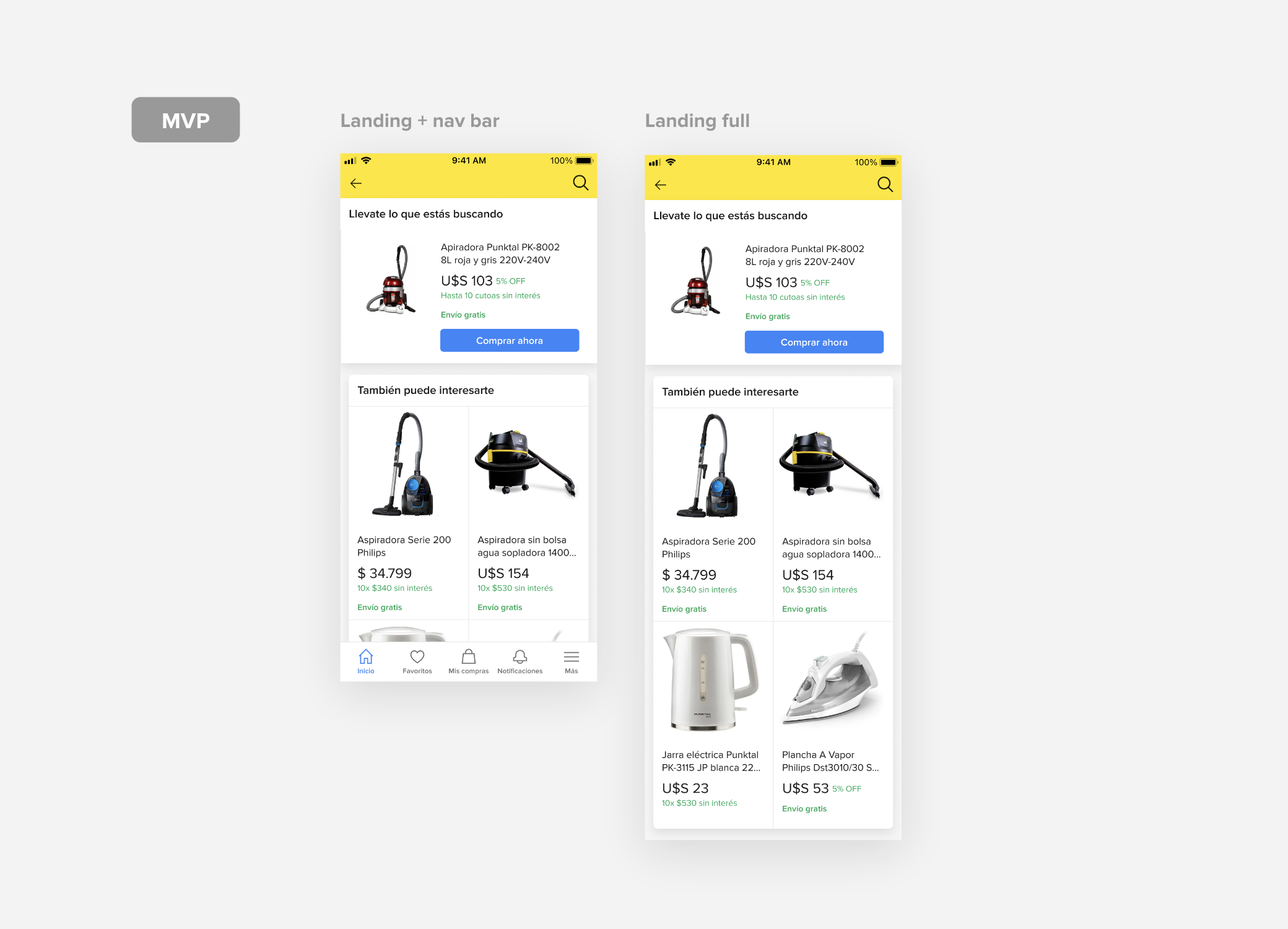
Existing push notification and landing page.
Process
My UX content partner and I analyzed the primary strategic campaigns, such as remarketing, cross-selling, and buy-again, to identify opportunities for improvement in design and content.
We also compared similar campaigns from other e-commerce and landing pages with similar interactions. We created alternatives using existing Mercado Libre algorithms, such as best sellers, deals, and other users who also bought/checked.
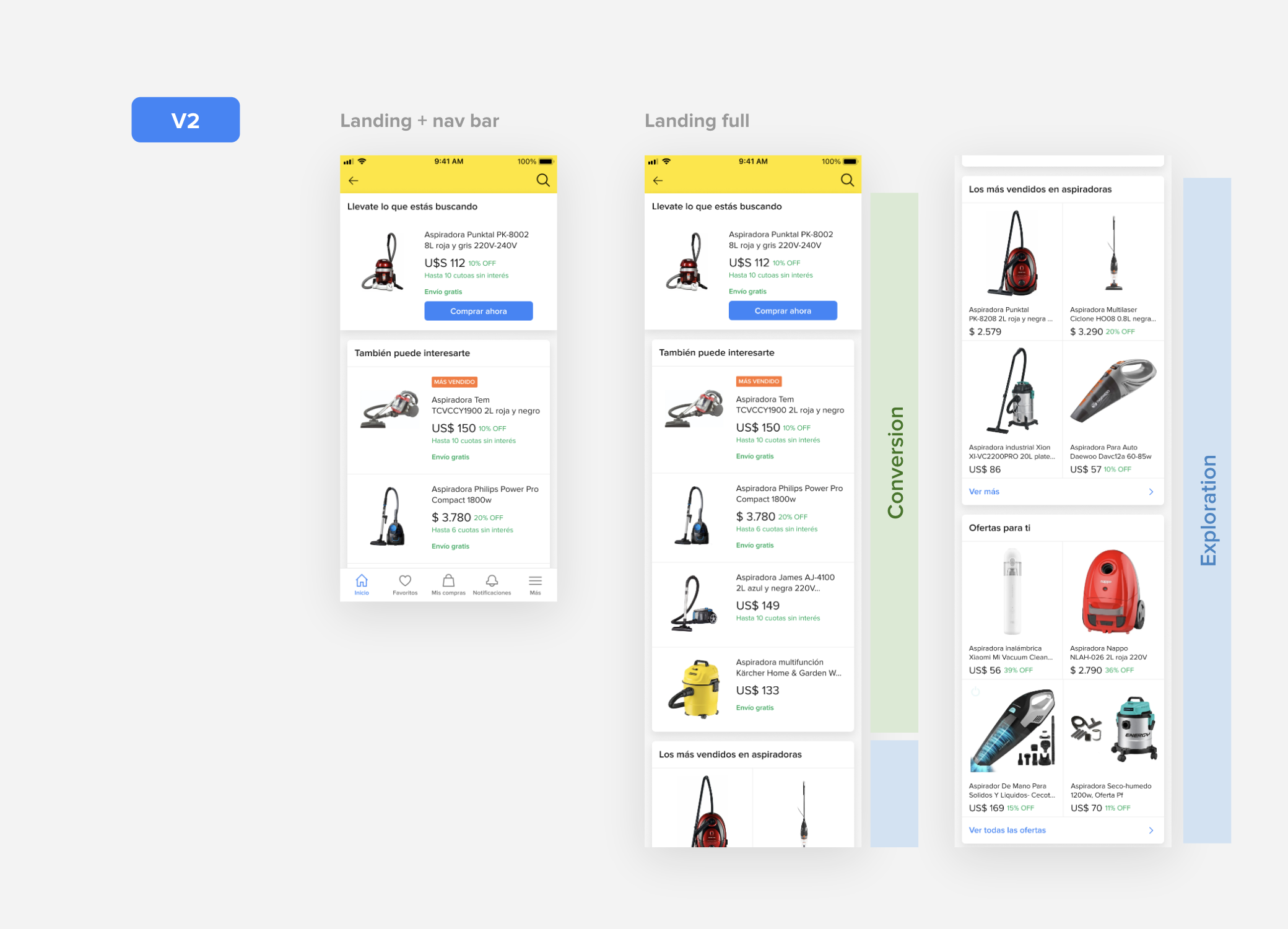
Our team selected the features that provided the most value to users and created minimum versions to learn and get closer to the final design with an end-game landing page:
We explored the use of horizontal and vertical scrolling to improve user experience.
We also personalized the wording of different sections and categories.
Add access to the recommendations landing from Mercado Libre’s home page.
We are currently working on new product recommendations incorporating AI algorithms.
*Due to intellectual property, I cannot share all of the final designs, but I can share some explorations related to this project that were not implemented.
Learnings and results
Here are some key takeaways from the process of iteration:
1. Users are more likely to respond positively to personalized push notifications with their names in the message.
2. Including a benefit, such as free shipping, can significantly increase the open rate of the notification.
3. When designing the landing page, it's essential to consider the rhythm of the content. This can be achieved by alternating between lists and grids, for example.
4. Starting with very similar offers and then transitioning to broader, more exploratory content can effectively engage users.
The strategic campaigns were redesigned, resulting in a 3.5% increase in the company's Total Gross Merchandise Volume (TGMV) in 2022.
In 2023, we continue improving and refining our designs based on previous learnings. Currently, we are working on incorporating AI algorithms to provide new product recommendations.